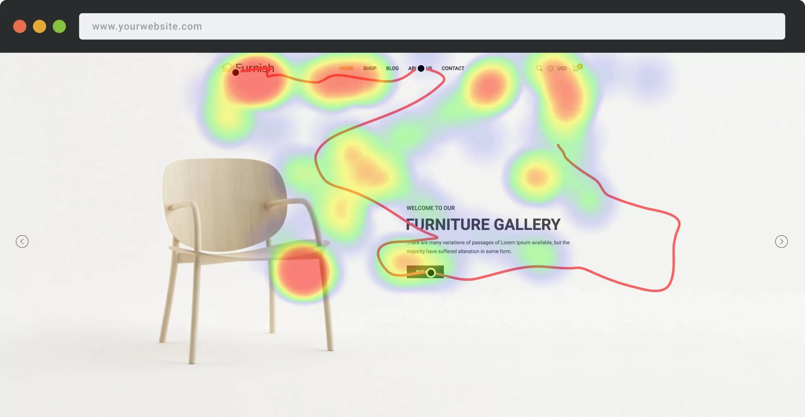
 The heat maps may be an exceptional tool for UX designers. But even among the fans of this instrument, there are many who do not have the slightest idea of what a ux heatmap is used for. Let’s fix that.
What is a heat map?
A heatmap UX allows you to present information in the most visual form. Not surprisingly, this tool has quickly gained popularity among usability optimization experts because it helps eliminate poor UX areas. And the bad user experience always leads to lower search engine rankings.
If you want to improve your website’s visibility and drive more traffic, you need to improve your UX design and rethink your content strategy first and all due to the availability of effective UX heatmap tools.
What Should I track down to evaluate UX?
If you don’t know how to improve your site’s UX, don’t play the guessing game trying to figure out which content strategy to choose. Use advanced tools to gather usability data and make informed strategic decisions via heatmap design.
By tracking website page views, bounce rates, email sign-ups, and other activities, you can identify critical UX issues and fix them. Here are the key parameters to track:
Track user journey
If you’re looking to improve your site design and make it user-friendly, don’t get hung up on a particular web page and a particular user action. Track the whole user journey as the series of steps and actions that users take while interacting with a website from the beginning till the end.
Track users clicks
By adding a back-to-top button and a horizontal scroll button, you’ll simplify your site’s navigation system. You will improve the overall experience of the site and make users happy. How can you know about that? It’s all due to the users’ click tracks. Also, it will be easier for you to consider placing calls to action at the top, bottom, or middle of your content if you have a look. Use every opportunity to attract users and you will be more likely to hit your conversion goal.
Intelligence 24/7
When users encounter a problem, they want immediate help from the support team. If your team doesn’t answer user questions right away, chances are they will leave your site and never come back for the experience. So, also track how users interact with your support chats and other forms.
Try advanced user testing tools
Want to know what real users think of your site? Testing is a way. Check out user testing solutions like Creabl or similar. These solutions are available and are worth it. Typically, these testing solutions may use picture-in-picture remote testing software or similar technology based on tracking users’ behaviors.
This means you can get a video that shows real users exploring your site: you can see users’ screens and track their actions, or even see users’ facial expressions. In addition, you can listen to their audio commentary, etc.
Apply Creabl as your testing solution that records each user’s activities and identifies returning visitors.
3 ways to use heat maps to evaluate UX
No matter the data your track, you need to be able to analyze the heatmaps, so that to apply them practically to improve your user experience in the current or the projects in the future. Here are a couple of ways to consider:
Showcase your best-performing designs
If you want your website content to work effectively in the long run, you should update your website design regularly.
Find CTAs with the most or least clicks
The importance of CTAs in UX design cannot be overestimated. If you choose the right buttons, you will win the attention of users.
Conversely, if you choose the wrong CTA, you will lower your conversions.
Optimize for mobile and desktop
Whatever niche you work in, you need to understand that users will be browsing your site more often using mobile devices rather than laptops or PCs. Therefore, it will be wise if you choose a mobile-centric approach. If you start with a mobile version and then adapt it to large screens, you will create a site that is perfect for modern users.
Exploit with the UX Tools
You can be sure that once you have a better understanding of how users interact with your site via heatmap ux design, you will have ideas on how to improve the UX of your site content. Even if you are a newborn to the field, you can find a solution that will improve your site’s rankings and increase conversions. For these objectives, apply the best tools for ux heatmap testing, and so much more.
Summary
There is little doubt that heat maps will continue to gain popularity among UX designers. The potential of this tool is extremely high. You can get ideas on what content to create to optimize your conversion rate, and increase engagement and retention. Heat maps are actively used by designers, UX specialists, and marketers to discover website usage patterns and make data-informed optimizations to increase conversion rate and revenue.
FAQ
Why are heat maps bad?
The most incredible difficulty is that it’s hard to map color onto a continuous scale. There are some exceptions to this rule. In the case of heat maps, the problem is challenging because our perception of a color changes depending upon the neighboring colors, as well.
What is a heatmap matrix?
A heatmap matrix is a graphical representation of the data where the individual values contained in a matrix are represented as colors.
What is a heatmap used for?
A website heat map is a great way to optimize your UX. An aggregated visualization of user mouse movement, clicks, scrolling, or taps are great hints for your design improvement and metrics improvements.
